

Designing a Room You Mostly Walk Through (& Why It Still Matters)
What Thoughts Actually Go Into A “Simple” Floor Plan
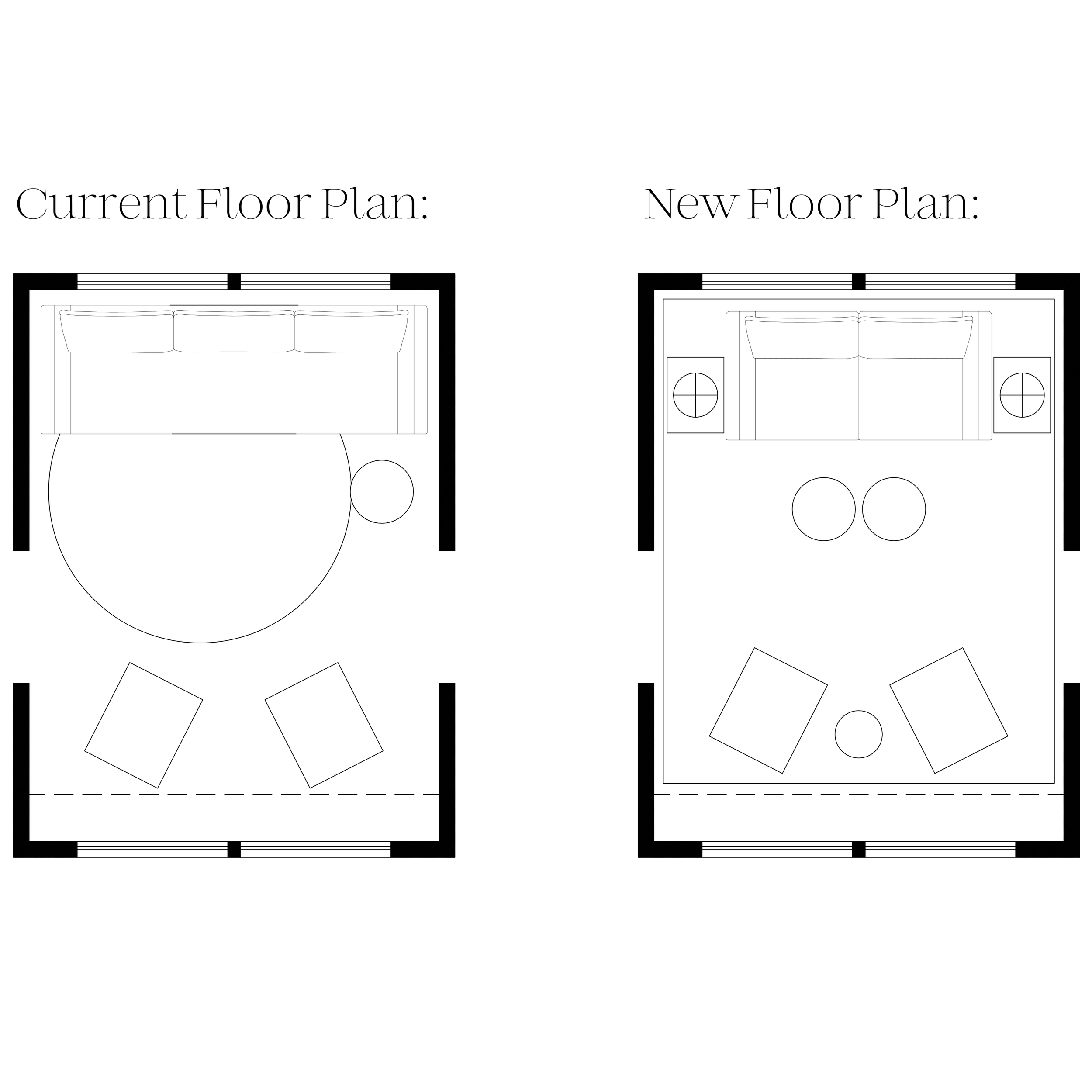
The Overlook: A Floor Plan Deep Dive
Today I want to walk through a floor plan from my current project, The Overlook. More specifically, a single room that has to work a little harder than it first appears.
On paper, it’s a sitting room. In reality, it’s also a vestibule that sits right outside of two kids’ bedrooms. This means the room functions as a transition/walkthrough space and a lounge. These two roles can easily start to fight each other if the layout isn’t handled carefully and thoughtfully.
The kids are in their later teens, so we’re not designing for toddlers… but we’re also not pretending this is a delicate, decorative parlor either. Everything needs to feel comfortable, flexible, and durable, without sliding into “bonus room sofa from college apartment” territory.
So the biggest constraint?
The center of the room has to stay clear to allow for entry to the bedrooms. No large coffee table and no furniture that creeps into the walkway. The floor plan has to respect the walking path first, and everything else gets designed around it. And we also don’t want the two areas on either side of the walkway to feel disconnected either. It’s a delicate dance and we’re here to dive deeper!
When the Walkway Splits the Room in Two
Because the center of this room has to function as a walkway to the bedrooms, the floor plan is essentially split down the middle. This creates a subtle but important design challenge: it’s very easy for each side of the room to start feeling like its own disconnected zone.
Right now, that’s exactly what’s happening.
The client currently has a small rug that sits only on the sofa side of the room. Instead of grounding the space, it actually highlights the imbalance, visually weighting one half of the room and leaving the other side feeling unfinished and detached. There’s nothing tying the two sides together, so the circulation path feels less like an intentional design move and more like a dividing line.
My first thought here is to introduce a large, anchoring area rug that visually spans the entirety of the room while still respecting the clear walkway through the center (we’re using a flat weave that still allows for an effortless yet durable walkway). This rug becomes the connective link, pairing the sofa wall, the opposing lounge chair wall, and the circulation path into one cohesive composition.
It’s also where we introduce a deep, rich color into the space. Beyond just defining the layout, the rug will act as an aesthetic anchor, grounding the lighter elements around it and giving the room a stronger sense of identity. Instead of two separate halves with a path in between, the goal is one unified room that simply happens to have movement passing through it.
That shift alone changes how the entire space is perceived, even before any other furniture is adjusted.
Fixing the Sofa Scale (and Why Just “Filling the Wall” Isn’t Always the Answer)
Right now, the sofa spans the entire window wall. At first glance, that seems like the obvious choice; filling the space usually gives a room that tailored, custom feel designers are always chasing.
So why not here?
Because when one side of the room is anchored by a long, visually heavy sofa, and the opposite side is composed of two relatively small swivel chairs, the balance of the room starts to tip. One side feels dominant, the other feels secondary, and the whole layout reads a little lopsided. Plus, with such a small floor plan, we’re hoping to introduce a few more layers and materials and a sofa taking up an entire wall eliminates a good opportunity to layer textures, different heights and fun fabrics.
It’s not that either choice is wrong on its own, it’s that they’re not speaking the same visual language.
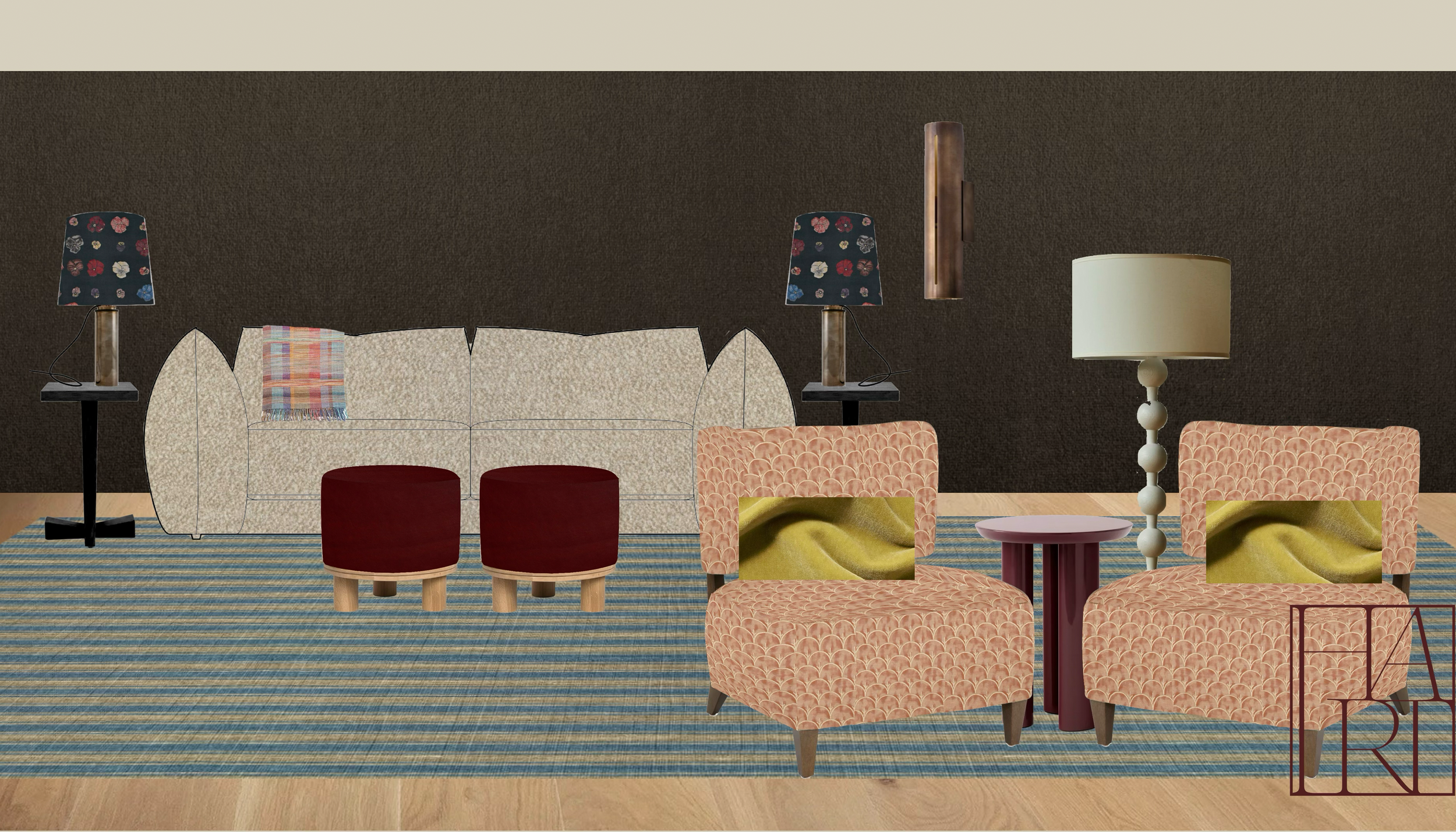
To bring balance back into the space (and to create a more intentional vignette along the window wall), we’re moving toward a smaller sofa (think loveseat scale, around 7 feet long) flanked by two end tables and topped with a pair of custom table lamps.
This does a few things at once:
It breaks up the long, uninterrupted line of upholstery.
It introduces negative space, which lets the floor-to-ceiling drapery actually be seen and appreciated.
And it creates a more layered, collected composition instead of one continuous block of furniture.
Visually, we go from “one big sofa against a wall” to a designed and thoughtful moment: upholstered center, sculptural wood tables, warm pools of light on either side and beautiful colorful fabrics. It feels more intentional, more architectural, effortless, and honestly, more inviting.
There’s also a fun bonus here: custom lamps mean custom shades, which gives us an opportunity to introduce a printed fabric and another layer of personality into the room without relying solely on pillows and accessories.
So while the sofa technically gets smaller, the wall itself becomes richer and more dimensional. And that shift is what helps this side of the room finally feel balanced with the seating across from it, not heavier, not lighter, just in conversation.
Going Bold (Because This Room Can Handle It)
One of the advantages of this sitting room is that it’s a contained space. It’s not visually connected to the main living areas, and that’s key if you want to explore a moodier, richer color palette that doesn’t have to flow seamlessly into the rest of the house.
Contained rooms give you permission to commit.
The client had already made one beautiful, bold choice: an espresso colored suede wallpaper. It’s rich, warm, and sets an incredible foundation but on its own, it can’t carry the entire room. And this is where I see people get stuck: they make one bold decision… and then stop.
Instead of letting that wallpaper feel like a lone statement, the better move is to lean in and keep building.
Here’s how we’re layering color and materials in this space:
Step One: Create a Clear Threshold
We’re adding painted wood casings at the entry into the room to clearly define when you’re entering and exiting this space. That visual break is important if you want to color drench or fully wallpaper a room; it signals that what happens inside can be different, richer, and more immersive than the spaces around it.
Step Two: Color Drench the Envelope
Next, we’re painting the ceiling and trim in a rich espresso tone to match the wallpaper. This essentially color drenches the room, eliminating harsh contrast lines and letting the architecture recede so the furnishings and textures can take center stage. It deepens the mood and makes the space feel intentionally cocooned.
Step Three: Anchor with a Counterbalance Color
Right now, the room lives almost entirely in the brown / beige / red family. It’s warm and cohesive, but it needs tension.
That’s where the rug comes in.
We’re introducing a rich, striped blue area rug as the base anchor. It adds contrast without fighting the warmth of the room, and it subtly references several things at once:
slightly coastal (this is a waterfront home and this home features a water view)
slightly Scandinavian (a style the client loves)
still traditional enough to feel at home with the architecture of the home
It grounds the space while also waking it up.
Step Four: Keep the Sofa Neutral (But Not Boring)
While the palette around it gets richer, the sofa stays in a cozy neutral fabric. And yes, while bouclé may feel a little overplayed right now, when it’s done right, I still love it.
It’s durable (important for a teen hangout space), soft and inviting, and reads expensive when paired with the right silhouette, which in this case, is doing a lot of the heavy lifting. The texture keeps the room from feeling flat without introducing another strong color into an already layered palette.
Step Five: Add a Confident Pop of Red
This is where the “unexpected red theory” really shines.
We’re introducing red through leather ottomans and a red lacquered side table. It’s bold, but it still lives comfortably within the overall color family of the room, so it doesn’t feel random. It’s just far enough outside the client’s usual comfort zone to feel exciting, which is exactly where good design tends to live.
Step Six: Soften with a Feminine Counterbalance
With a darker, moodier envelope and a sofa that leans more modern and slightly masculine, the room needs something to soften the composition.
This is where I immediately go to Fortuny.
I selected their Arboreto pattern in pink and gold. The scalloped motif nods to traditional/historic pattern, while the color combination feels more unexpected and romantic. It introduces movement, warmth, and a lighter visual note that keeps the room from feeling too heavy.
Step Seven: Finish with Something Truly Unexpected
Finally: chartreuse.
It’s bright, fresh, and unapologetically bold, but it plays beautifully with the pink in the chairs and the blue in the rug. It adds a final layer of contrast and energy that keeps the palette from feeling too serious or too safe.
It’s the kind of color that makes a room feel designed, not just coordinated.
Bringing It All Back to the Floor Plan
What I love about this room is that every decision, from the rug size, to the sofa scale, to the color palette, comes back to the same starting point: the floor plan and how the room is actually used.
The circulation path shaped the layout.
The layout influenced the furniture proportions.
And once those bones were right, the color and materials could do what they do best: bring depth, personality, and emotion into the space.
That’s always the order of operations. Pretty things come second. Function comes first.
If you’d like to see how The Overlook continues to take shape, I’ll be sharing more real-time updates, sourcing decisions, and behind-the-scenes design thinking as the project moves forward, so make sure you’re subscribed if you want to follow along.
And if you’re in the middle of a renovation or furnishing project and want help making sense of your own floor plan before you start buying things, you can learn more about working with me at sarahhartinteriordesign.com.
Because great rooms don’t start with pillows.
They start with plans.