

An Interior Designer’s Honest Take on Choosing and Placing Art
Spoiler: It’s Not About Matching Your Sofa
Let’s Talk About Art (And Why Most Homes Get It Wrong)
Lately, almost every single client conversation (whether it’s my mudroom renovation in Mount Pleasant, furnishings project on Daniel Island, or John’s Island custom new build) eventually turns into “so... what do I do about art?”
So let’s talk about it.
First, a quick disclaimer: I firmly believe art consulting is its own profession — a really important one — and there are people out there who do it far better than I do as their full-time gig. But as a Charleston interior designer, I’m at least thinking about art in every single room I design, so I’ve got some opinions or guidelines. And I’m always happy to help my clients get pointed in the right direction.
When I’m designing a home — whether it’s a historic downtown Charleston renovation or a brand new build out on Daniel Island — I usually have a rough idea of where art is going before we ever get to the fun part of actually picking it. Mostly I’m thinking about three things: dimensions, framing style, and sometimes medium (photography vs. abstract vs. something else entirely).
But here’s the thing I want every homeowner reading this to actually take away today:
The Only Real Rule: Art Should Make You Feel Something
Art does not have to “match” your space. It doesn’t need to coordinate with your sofa, your rug, or your paint color. Honestly? It’s actually better that it doesn’t.
Good art should simply evoke an emotion. It should remind you of a trip you took, a memory you love, or an artist whose story genuinely moves you. It might be your kid’s drawing from last summer, framed properly. It might be a concert ticket stub from a show that marked a moment in your life. None of that has anything to do with your color palette… and that’s exactly the point.
Here’s a little secret from someone who’s spent a lot of time inside high-end homes: if you look closely at art in the best interior photographs, the color from the artwork rarely shows up in the big furniture pieces. If it echoes anywhere, it’s in the accessories: a pillow, a stack of books, a vase. And that’s usually because the accessory was chosen after the art, to complement it, not the other way around.
We’re not decorating for the room, we’re decorating for the person. Buy what makes you happy, full stop.
A Few Placement Guidelines (Not Rules — Guidelines)
Once you’ve got the art, placement is where most people psych themselves out. A few things I always keep in mind:
Don’t Hang it Too High. The general guideline is eye level; think “5’ On Center/OC,” meaning the center of the artwork sits about 5 feet above the finished floor.
Above Furniture, Keep it Tight. If a piece is anchored above a sofa, console, or bed, aim for roughly 6–8 inches above it, with 1 foot as the max. Float it too high and the whole grouping feels disconnected.
Get a Little Funky With it. Beyond those two guardrails, there really aren’t rules. Off-center placement can be exactly what a room needs to feel collected instead of stiff. Stacking two or three smaller pieces vertically is a great trick for a long, narrow stretch of wall; think stairwells or hallways, which almost every Charleston single house or Daniel Island new build seems to have plenty of.
Embrace Negative Space. Not every wall needs something on it. Empty space lets the pieces you do hang actually breathe.
Balance Your Scale. Don’t let every piece in the room or house be small. Pair smaller, more personal pieces with at least one or two large-scale statement pieces so the whole home feels intentional, not scattered.
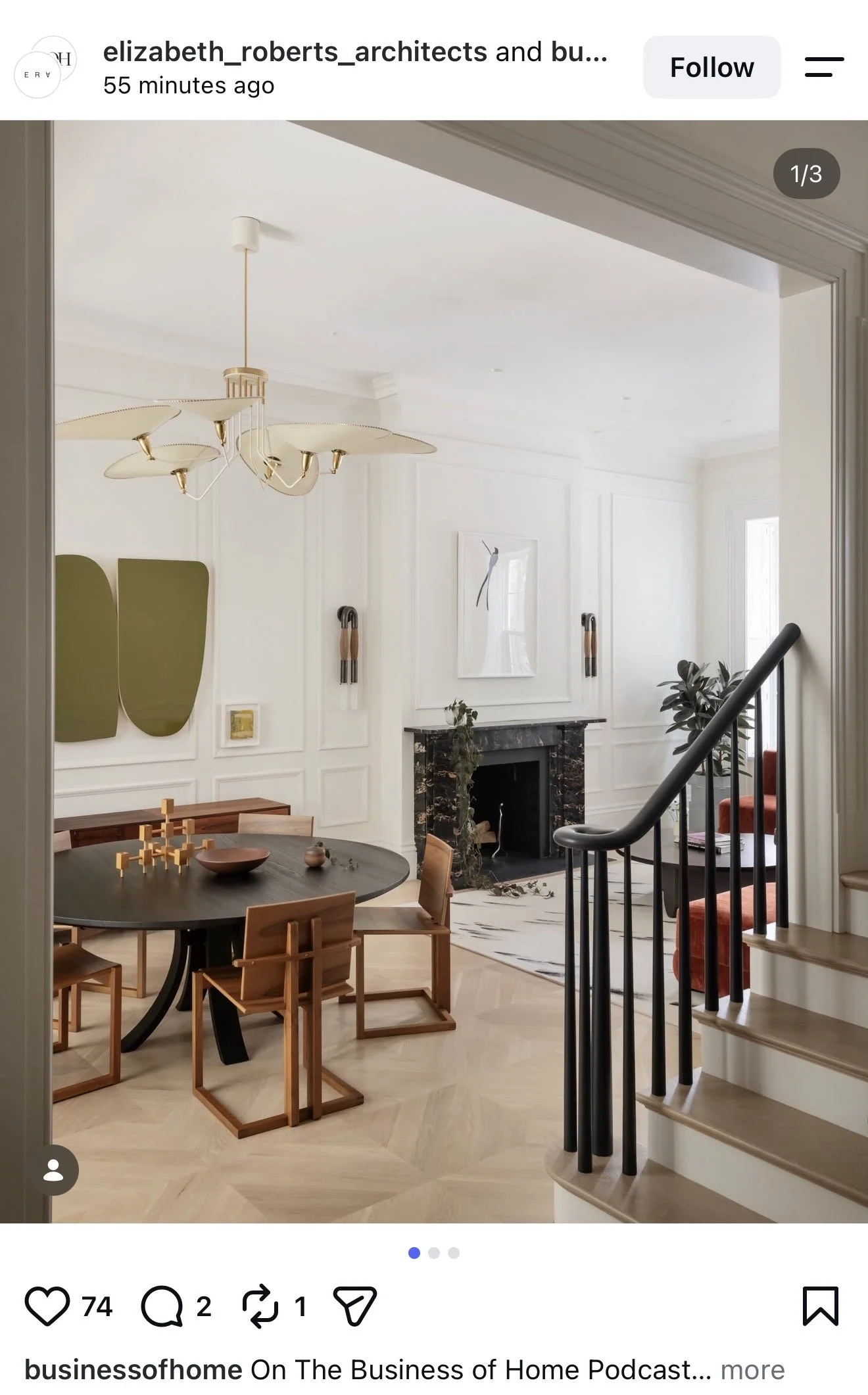
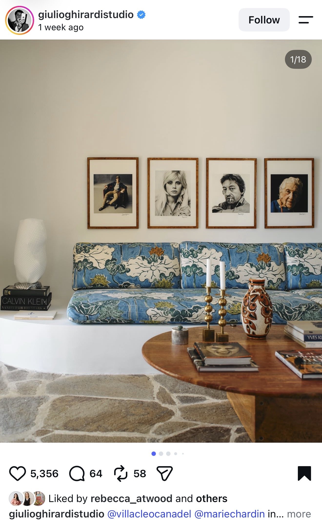
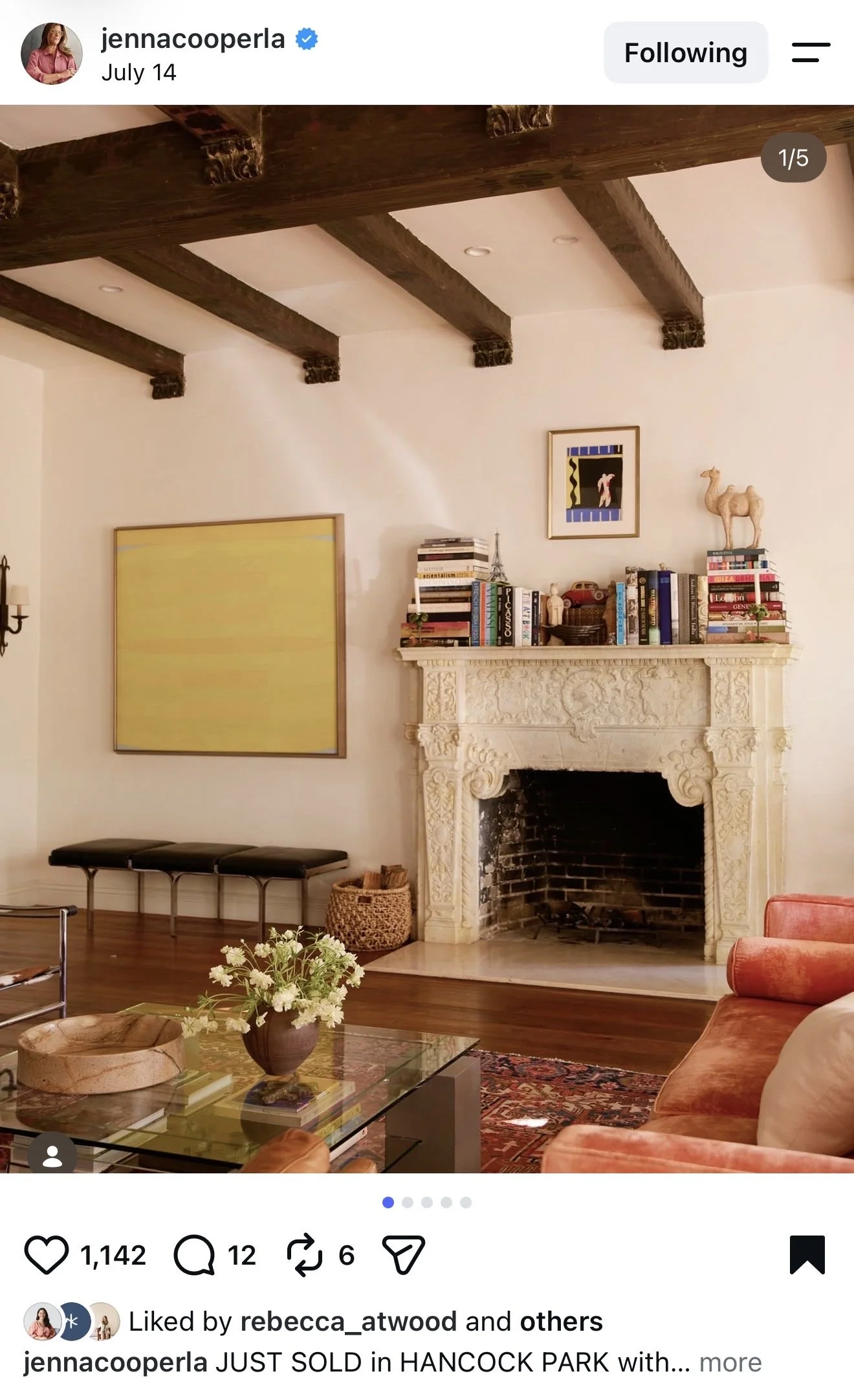
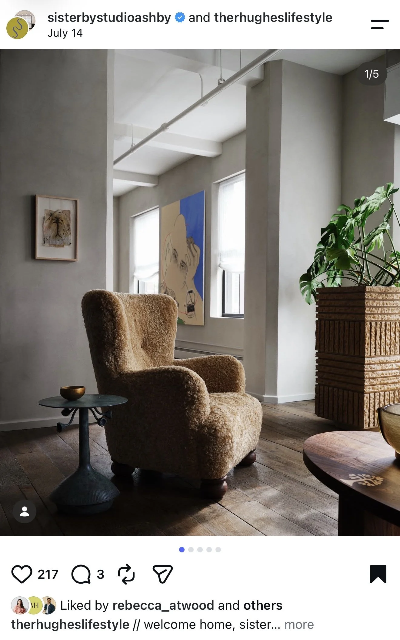
Let’s Look at a Few Real Examples
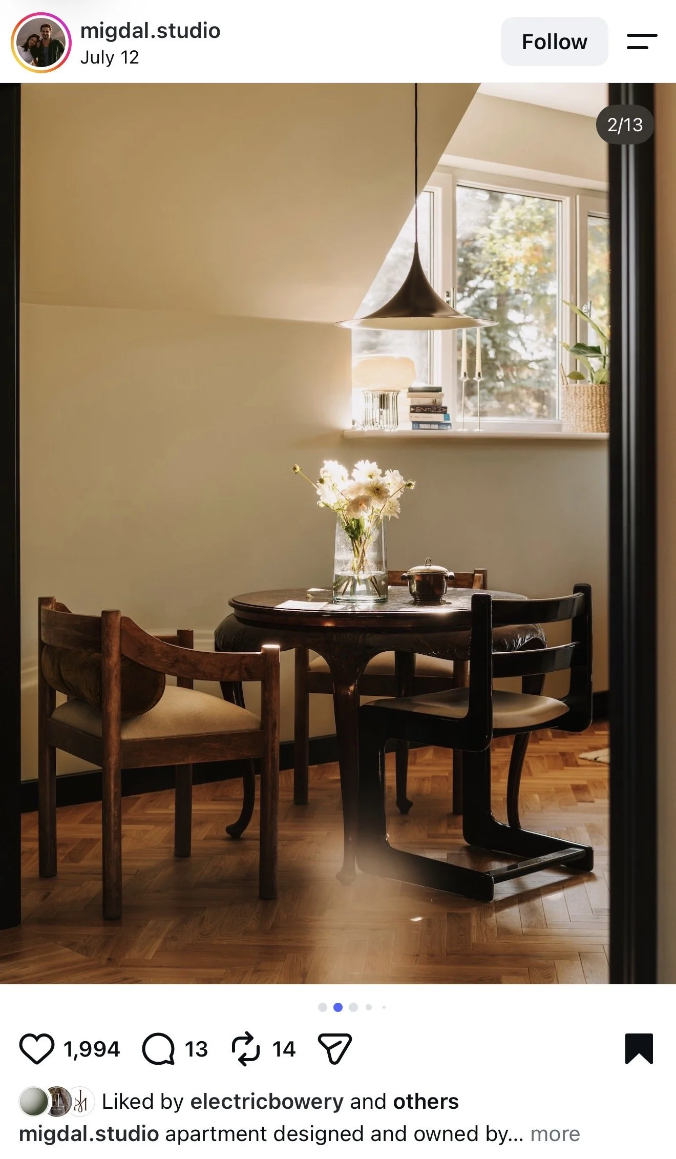
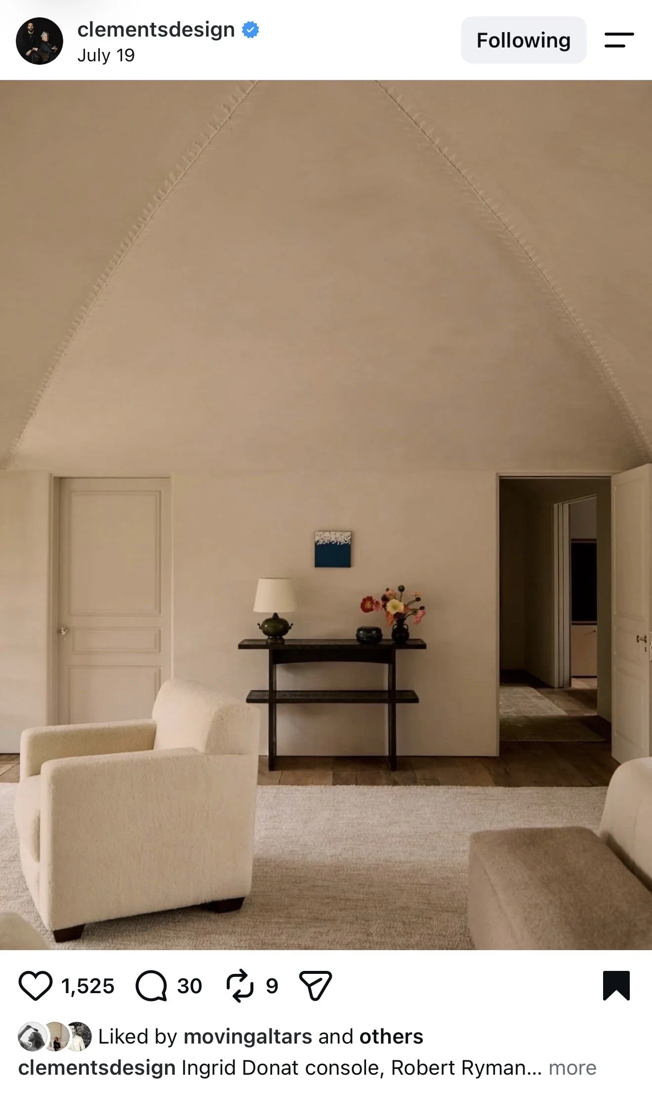
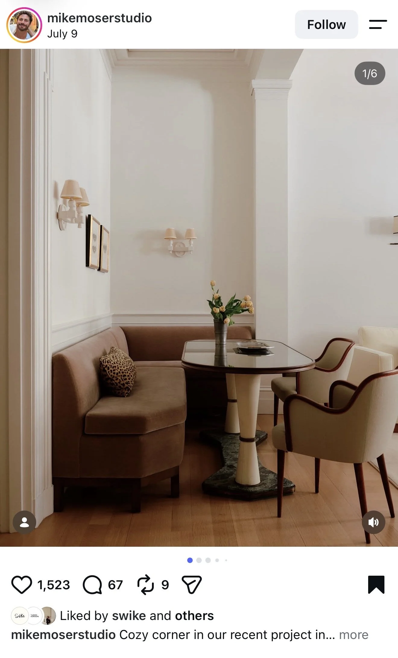
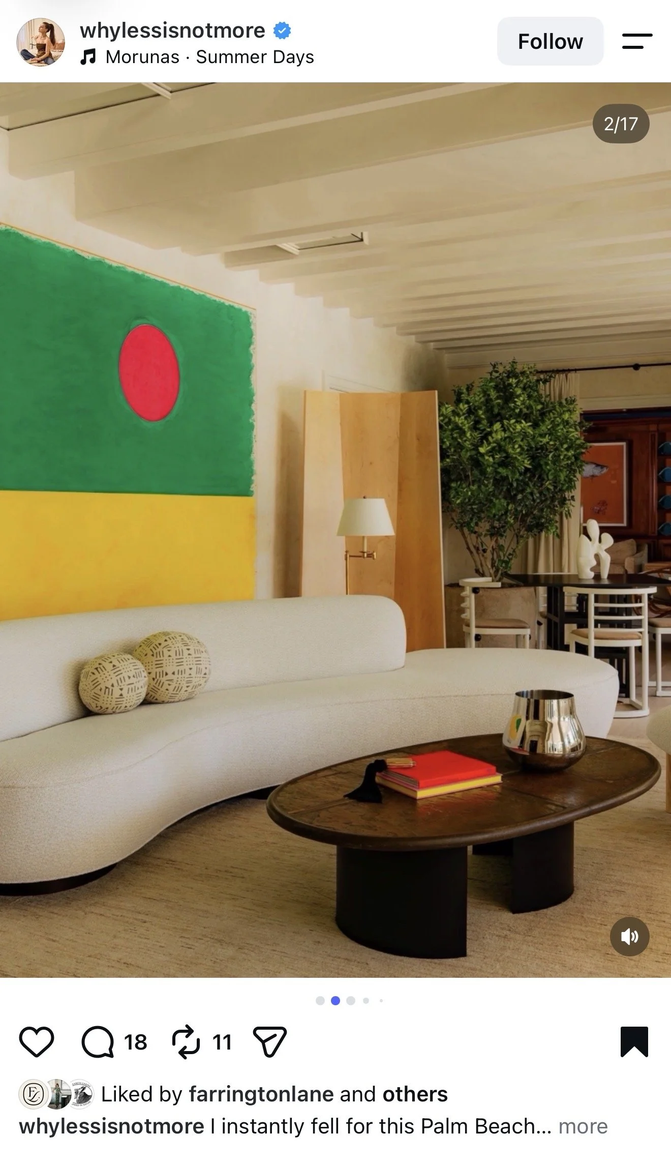
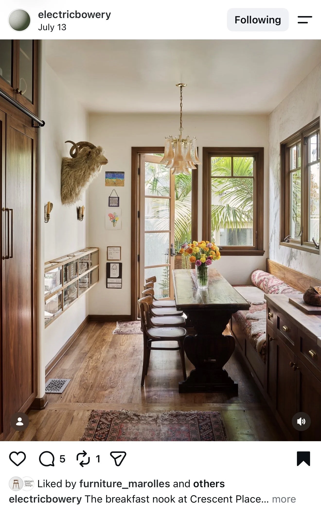
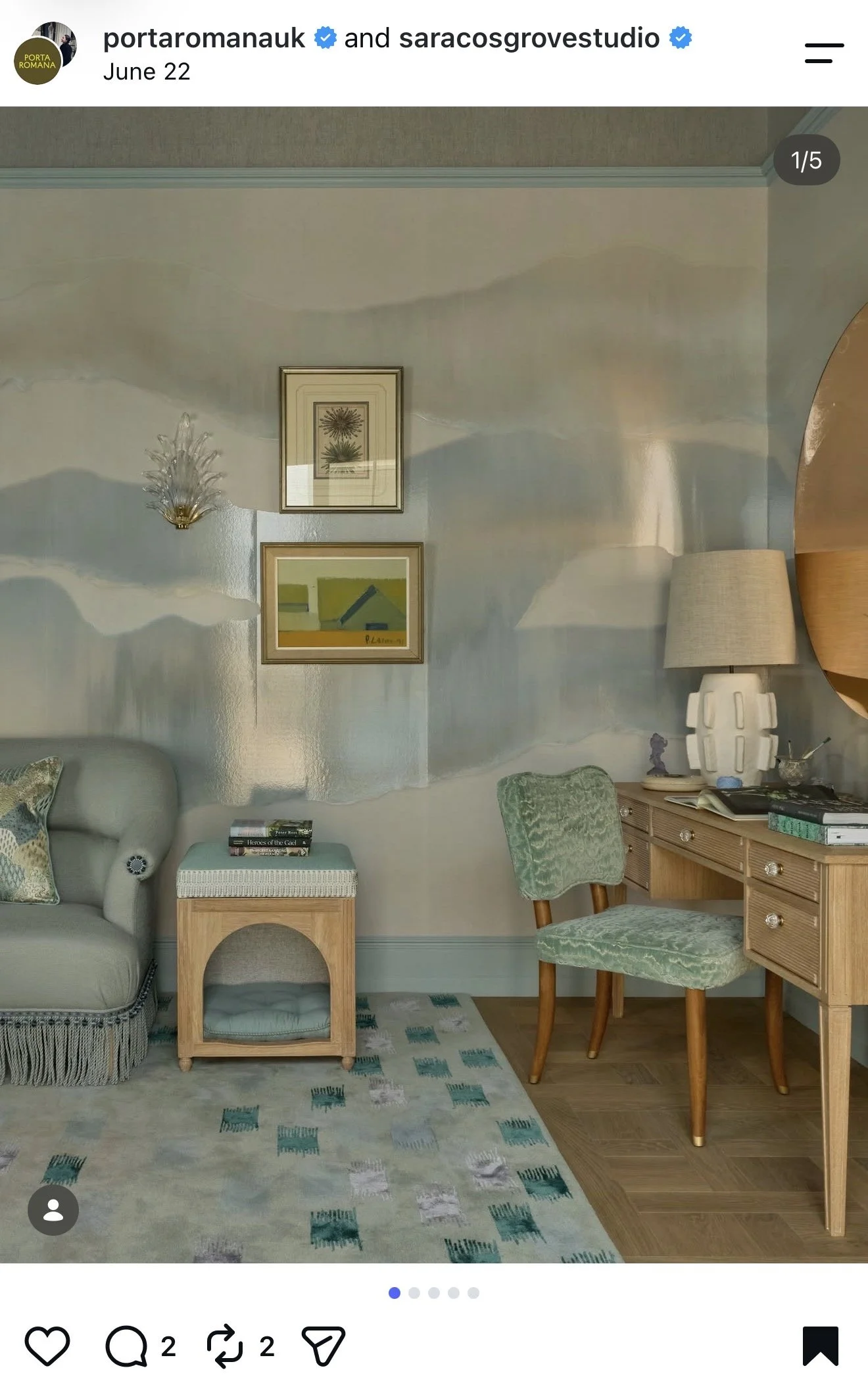
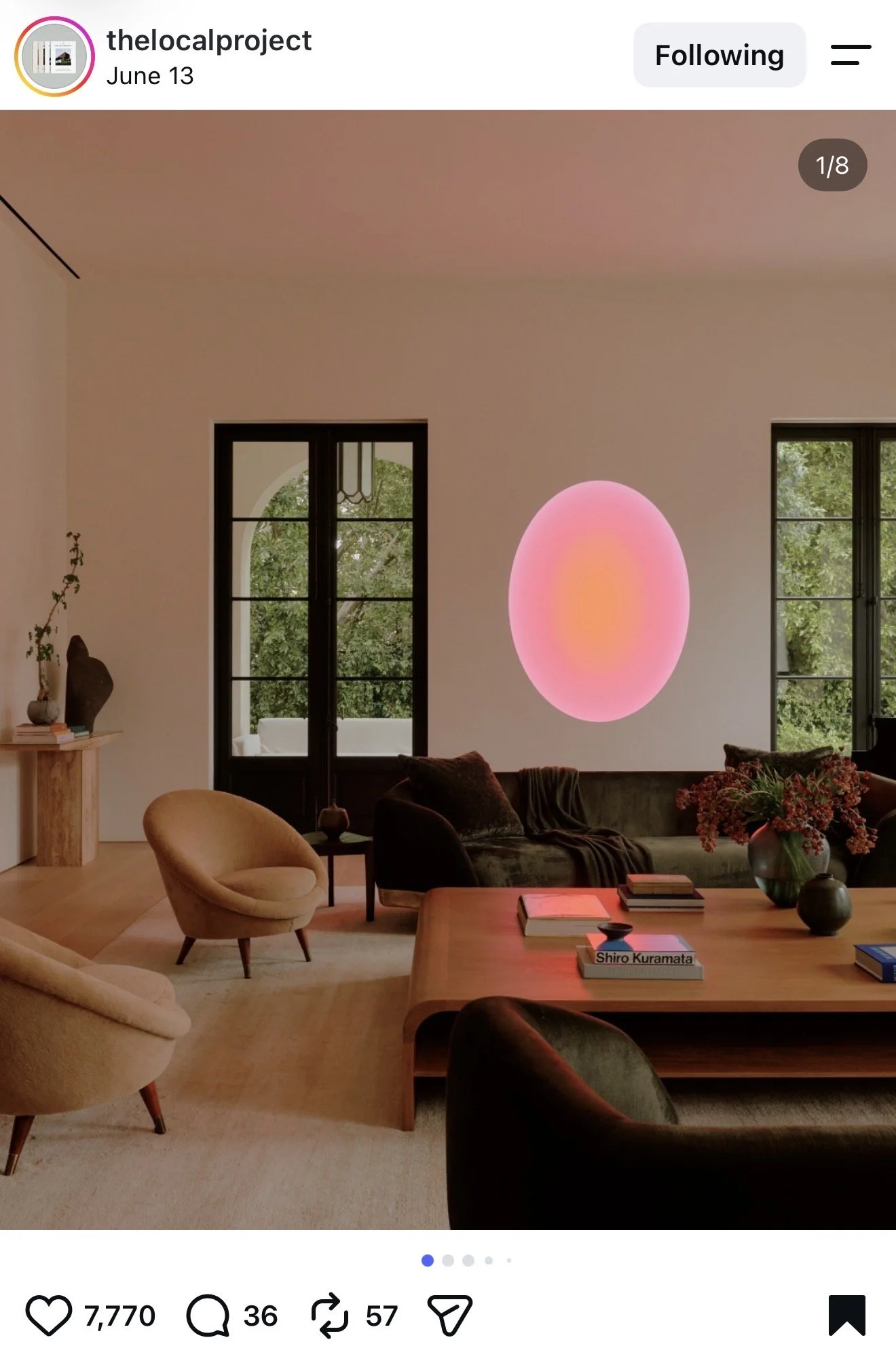
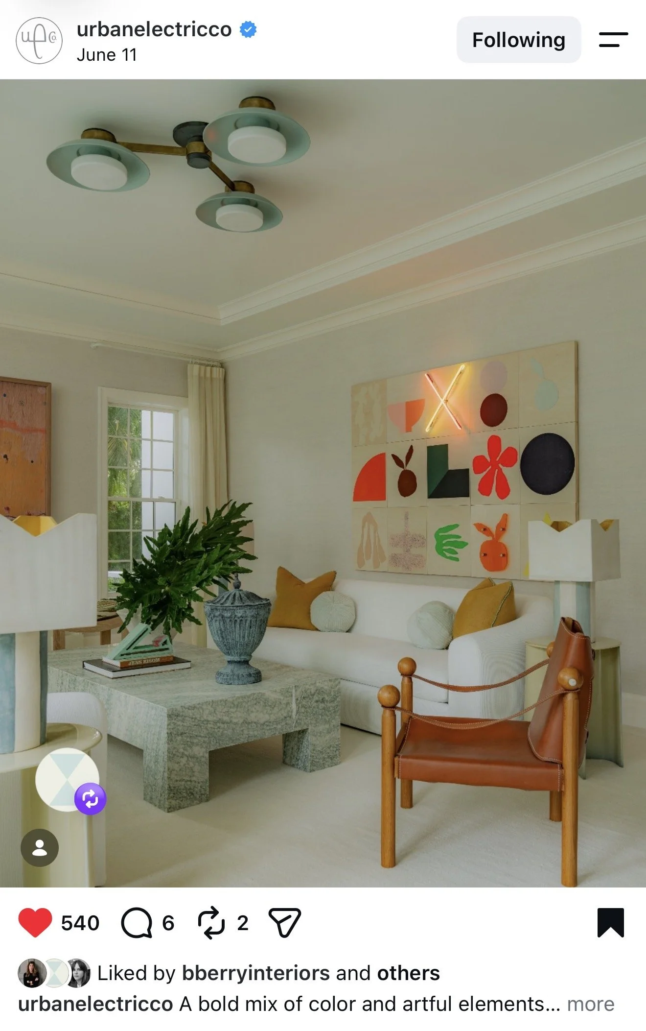
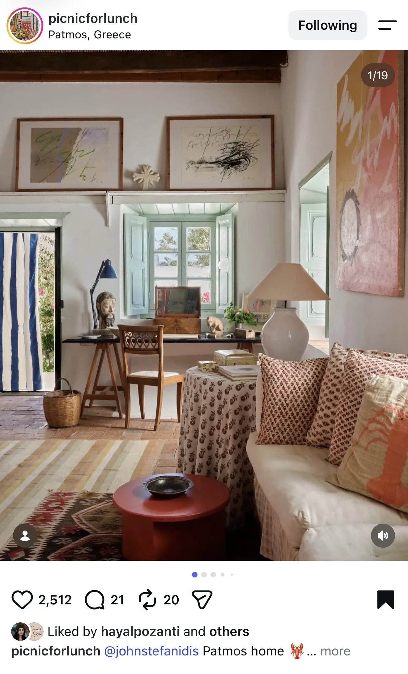
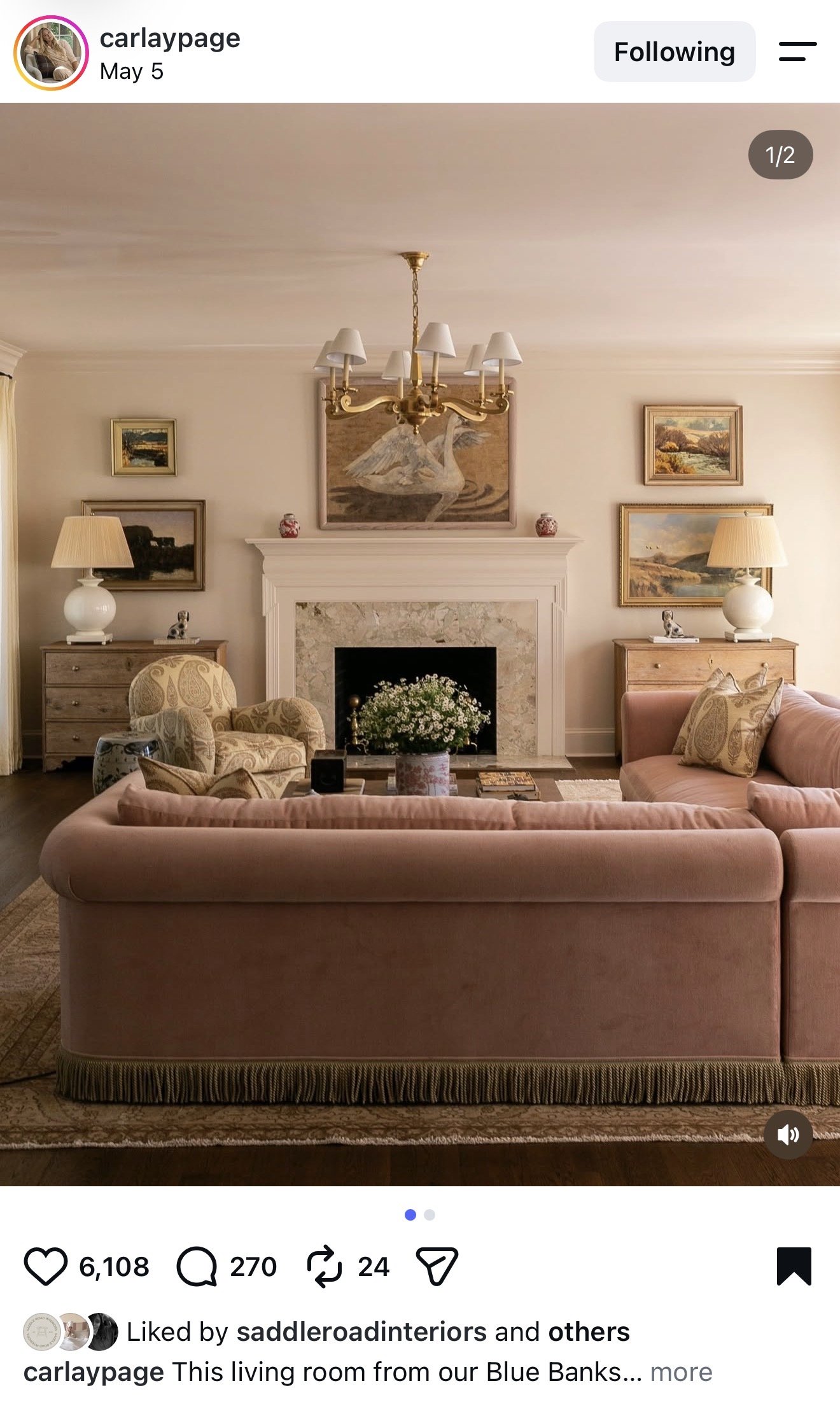
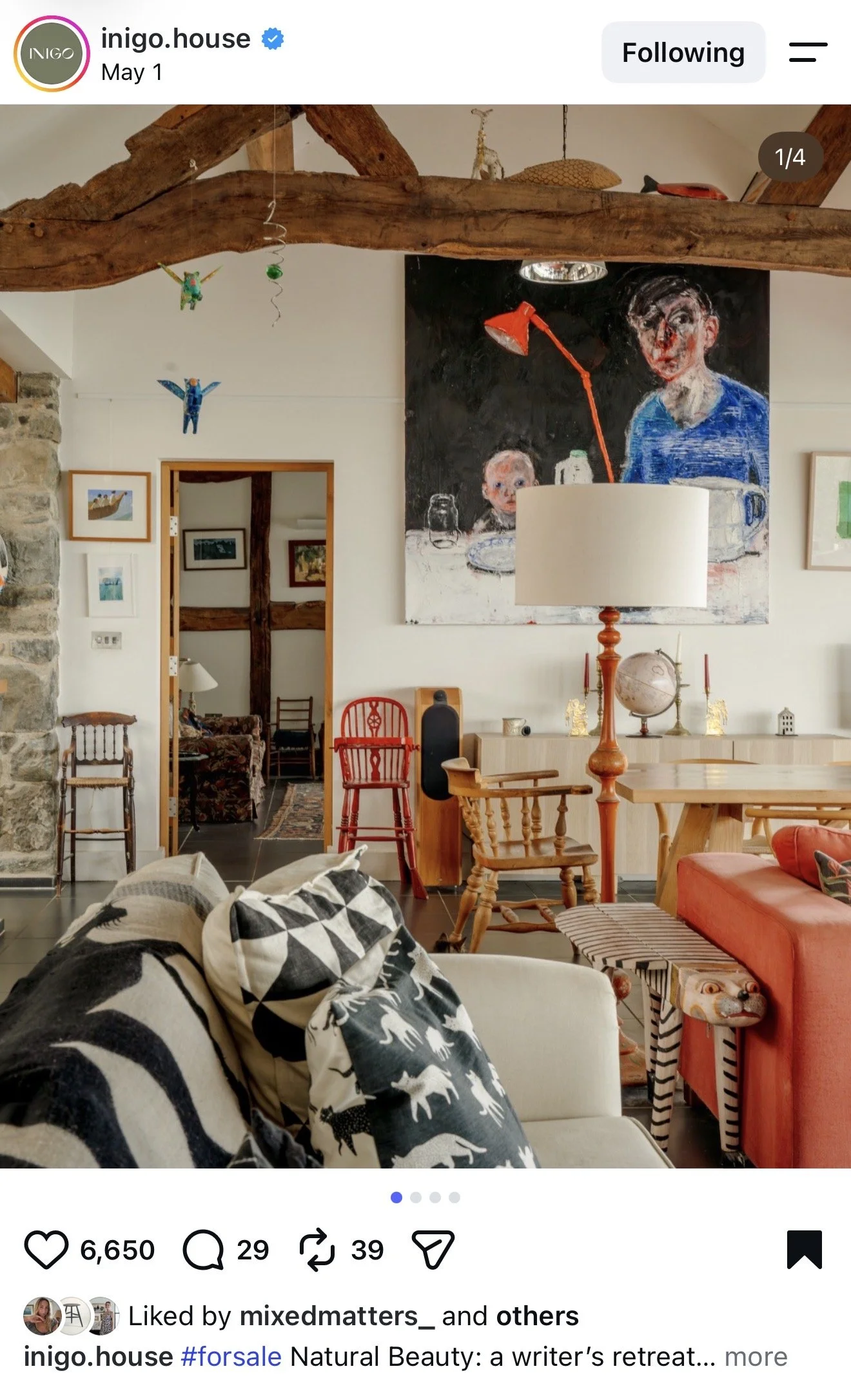
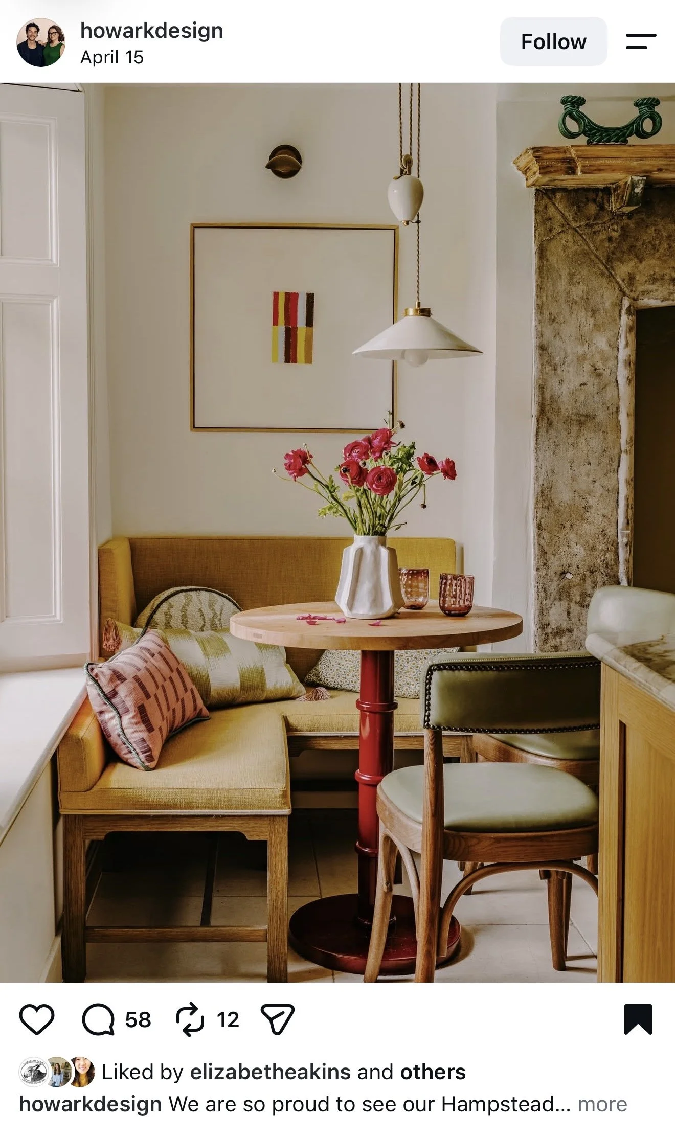
I urge you to investigate the colors and the sizes of these pieces. They may not be exactly what you would expect and may not follow the typical “rules” of art. All pieces are, however, anchored to a piece or moment in the room. None of these pieces “go” or coordinate with the colors of the room. All of these pieces feel effortless, cool and collected; almost as if the clients owned these pieces before the room was designed. I love how kids art is featured, portraits of people are featured, modern art is used, vintage art is used, etc. There are no rules with art! It’s all about balance, scale, proportions, stories and emotions. Art is a feeling!
Where This Gets Tricky (And Where I Come In)
Here’s the honest part: knowing the rule — art should evoke emotion — is the easy 20%. The hard 80% is everything else. What size actually works for that specific wall. Whether a stack of frames or one large piece is right for your specific ceiling height and window placement, furniture size, etc.. How to frame a piece so it reads as intentional instead of an afterthought. How to make sure the piece you love with your whole heart doesn’t end up feeling random once it’s actually on the wall.
This is exactly the kind of thing I help clients with through hourly design consulting. Whether that’s sourcing art from the right places for your budget and taste, or simply putting together a plan with the dimensions, placement heights, and framing direction so you (or your art consultant, or your framer) can take it from there with total confidence, I’m here for you. It’s a small hourly investment that saves you from a lot of expensive guessing, and essentially gives you a shopping list of what to look out for in the future. It’s one of my favorite ways to work with clients who want a professional eye without a full design retainer.
If that sounds useful, shoot me a message or email, I’d love to learn about your home!